
The mainland retail brand Pang Donglai, known for its high-quality service and strict quality control, has recently made a decision to adjust the new packaging of its DL natural mineral water. The product was soon discovered to have a visual resemblance risk in terms of packaging design shortly after it was put on the shelves for sale. The company subsequently decided to redesign the product packaging and adjust the listing schedule. The incident quickly attracted market attention once exposed, prompting a reassessment of the increasingly fierce “aesthetics competition” in the current food and beverage industry.
On the evening of May 29, Pang Donglai Supermarket Co., Ltd. in Xuchang City, Henan Province, posted a statement stating that the new packaging of Pang Donglai’s DL natural mineral water was temporarily suspended from listing before market launch due to a possible visual similarity in bottle design with existing products on the market of the same category. They are in communication with the relevant brand manufacturers.
The statement mentioned that the situation that arose this time was a significant design error. The Pang Donglai Group’s product committee decided to stop selling the first batch of the new packaging DL natural mineral water after sales completed on May 31.
In the comments section of the announcement of the suspension of sales by Pang Donglai, some netizens posted a mineral water product named “Liancheng Si Quan,” whose packaging also had similar patterns to Pang Donglai’s newly packaged mineral water, branded as “Gumeixin Daxin.”
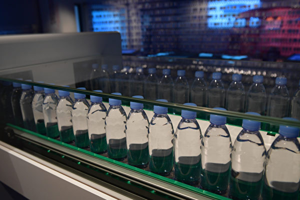
According to current pricing, the newly packaged DL natural mineral water, featuring the design of “Angel Wings,” is priced at 1.3 yuan for a 360ml bottle, which is an increase of 0.1 yuan compared to the previous old packaging.
On May 7, Xuchang Pang Donglai Supermarket Co., Ltd. released an upgrade explanation for the packaging of DL natural mineral water, stating that the all-new packaging was designed by the French team Dragon Rouge, integrating Pang Donglai’s cultural concept of “freedom and love” with “Angel Wings” as the core visual element. The plan was to be put on shelves for sale on May 9.
However, on May 9, the China Trademark Website showed that multiple trademarks under “Gumeixin Daxin” had been successfully registered by Xuchang Gumei Trading Co., Ltd., including the trademark of “Gumeixin Daxin” covering mineral water products, with an exclusive right term from May 7, 2023, to May 6, 2033.
Over the years, Pang Donglai has been viewed by many consumers in the mainland retail industry as a “benchmark of reputation.” From product selection, after-sales service to price management, Pang Donglai has been known for its emphasis on quality. However, within just over 20 days of launching its new product, it announced a complete halt in sales, a redesign of packaging, and categorized this event as a significant design error, sparking market attention and discussions.
An article by a blogger named “Qunshuzhiyao” points out that the issues exposed behind this decision are worth deeper consideration than just a packaging error: When food companies prioritize packaging innovation over quality refinement, putting visual marketing ahead of product core, they essentially lose sight of the industry’s original intention. The eternal truth in the food industry has always been “quality is king.” The significance of packaging is to carry the product, protect its quality, aid in circulation, rather than becoming the core selling point and competitive barrier of the product. A mineral water with ordinary water quality and mediocre taste, no matter how exquisite the packaging design, how innovative and outstanding the creativity, it is ultimately superficial; conversely, true good water, even with simple and plain packaging, can win long-lasting market recognition with its solid quality.
The article believes that the key issue lies in the serious deviation in resource allocation and R&D focus of companies. Massive costs are spent on exterior design, only to have it all rendered useless due to design errors, leading to not only wastage of corporate resources but also revealing the misalignment of the brand management focus to consumers.
Pang Donglai’s mistake this time is not an isolated case in the entire food and beverage industry. In recent years, with the rise of social media and the emergence of young consumer groups, the food and beverage market has gradually entered the era of “aesthetics economy.” From limited edition cups of tea brands, collaborative packaging of snack products to creative bottle shapes introduced by mineral water companies, packaging design has become an important component of brand competition.
“Qunshuzhiyao” believes that this is a microcosm of the industry’s impetuous atmosphere. The competition in the food industry ultimately revolves around quality and trust. Exquisite packaging can only attract temporary attention, while excellent quality can retain long-lasting consumer loyalty. Discarding the reversed impetuosity, adhering to the industry’s bottom line of quality, allocating resources practically, focusing on details authentically, is the only true path for all food companies to remain steadfast and far-reaching.